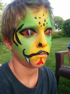
This summer I have picked up face painting which is a lot of fun. My painting skills have definitely improved because of this. The photos below are only the tip of the ice berg.
Saturday, August 26, 2017
Wednesday, July 12, 2017
the Fisherman
Last semester I took a picture book class that gave me the opportunity to create my very own picture book. This process started with us writing and reading our manuscripts to the class as if it were story time. Next, we did concept art and a story board for how we envisioned the book to pan out. Following, we created tight sketches of each page that we eventually made into finished art work. My book is 8.5" x 11" and was done in watercolor. My story is about a fisherman who never catches a fish but was too stubborn to give up. I finished my book and now I'm in the process of trying to get it published. My hope is that this project could could get my foot in the door of the illustrating industry. Until then, anybody can purchase their own copy of The Fisherman on Lulu. Here is the link: http://www.lulu.com/shop/brigid-malloy/the-fisherman/paperback/product-23219446.html
Wednesday, April 5, 2017
First Stage Children's Theater
Before Christmas break, my class was given a project to produce three illustrations for three plays that each of us were assigned. Selected illustrations would be printed in a brochure for First Stage Children's Theater. One of the plays I was given was the Miraculous Journey of Edward Tulane. It is about a china doll rabbit that gets lost by his original owner. He then gets recycled by several owners, giving him different perspectives on life. The book is originally written by Kate DiCamillo and I highly recommend anyone to read it.
For this project I went with the watercolors again. I took the major motifs from the story and put them together in one cohesive composition. This way bits and pieces of the story are shown to the viewer giving them an idea of Edward's journey.
My illustration will be printed for this play's brochure.
Sunday, March 26, 2017
Synergy
On March 10th I was able to display my work at an AIGA-UWM Gallery called Synergy. This was a student-run art show hosted at Kenilworth Square in Milwaukee. This was an interesting experience for I was given a 5'x10' wall space which I had to fill up with as much artwork I could muster. After deciding what to display, I had to make sure everything was presentable by matting and framing the pieces. This event was for one night only which meant I had to uninstall my space right after the show. It was fun to speak to people who were curious of what I do and receive their feedback. This shows me that many people are enjoying my work and it encourages me to continue.
Thursday, March 9, 2017
Penfield Poster
My last project was to illustrate a poster for Penfield Children's Center's charity event. This event is a croquet ball with an auction which donors will bid on three posters selected from my class. The main subject of the piece was entirely up to the illustrator but we had to integrate given text, croquet equipment and keep in mind of the children as the target audience. For the process we had to come up with ten concepts, select two of our strongest ideas from these concepts and create tight sketches. From there we presented our tight sketches to Cramer-Krasselt which is an advertising agency that promotes the event. Cramer-Krasselt chose the strongest concept of the two tight sketches which we proceeded to finalize.
This poster was a new challenge for me. One of the reasons was that the final dimensions of the piece were 26" x 40". I was not sure how I was going to create this piece in terms of medium. I was thinking of scaling down my design and printing it on watercolor paper. Then I would scan in the final with a high resolution so I would be able to blow it up to the required dimensions with out the image getting pixelated. However, if I created this in the traditional medium it would restrict me from making any changes after critique. After talking to some classmates, I learned about digital brushed that mimic watercolor brushes. This saved my concept for I was able to make adjustments while keeping my style.
Overall I am happy with the final design and I cannot wait to see my poster printed in large scale.
Sunday, January 22, 2017
Over Christmas break I wanted to make a watercolor piece that would help "beef up" my portfolio. I was doodling in my sketchbook trying to come up with a scene that would be fun to illustrate. Eventually I came up with the idea of illustrating something that could be real and odd at the same time, hoping to create a sense of fantasy. The idea of accordions came to mind for they are bizarre and charming instruments. At first I wanted to illustrate one player but thought it would be more ridiculous for there to be three. This piece is 8"x 10" on watercolor paper.
Tuesday, November 22, 2016
Above are a couple of illustrations that I took from my sketchbook that I thought were the most successful or interesting. All these pictures were made using a black ink brush pen that was waterproof so that I am able to add watercolor later if I like. The illustration with the plants at the top, I made originally as a study which lead me to play around with the composition by adding more elements. The Second piece from the top is drawn from imagination and observation. I would go out and sit at a coffee shop and basically people watch. When there was an interesting character walking by I would make up a story of why they are there and then try to make a caricature of them. For the overall page, I tried to fill up the space as best as I could with subjects as well as fill. What I mean by fill is by giving the clothes texture, pattern or some sort of gradient so that its not just black outline. This could help in telling the character's story. The bottom illustration of the llama is probably my favorite because it was a doodle that turned out looking like a finished illustration.
Monday, November 7, 2016
This is one of those pieces I make that turn out better than I expected. This shows that I need to keep making art because somewhere in the pile I get something worth keeping. This is a wood burning with autumn red acrylic for the leaves. This gives the piece a timeless feel where it can be out all year round for any holiday or season.
Above is a watercolor I created for the book cover project I was assigned in my Illustration class. The project was that we had to choose a book to redesign it's cover and assemble the new cover onto the book itself. I picked the classic Secret Garden but wished that I picked something a little more contemporary. The reason behind this is that the Secret Garden has been illustrated hundreds of times and half of them show this exact scene of the girl and the door. I had a lot of fun making this image but once I inserted it with the rest of the cover on the computer, it looked unfinished. I spent too long on this single illustration that I did not really consider the rest of the book. As I printed out the final, the cover not only looked unfinished but a tad cliche. If I could change anything it would be that instead of completing this cover in traditional and non traditional mediums I would have done it entirely traditional.
Yesterday, I attended an opening for The Starting Out exhibit at New Visions Gallery in Marshfield, Wisconsin. Here, I submitted my watercolor illustration that I made over the summer. This was a juried exhibition which means there was a board that decided which pieces were to be displayed. I was exited to receive the email for it felt like I was given a break. However, it's a break so that means I need to get back to work afterwards and start cranking out more art. Hopefully I can submit more pieces to galleries such as this one and get noticed. The president from MIAD, Jeff Morin, spoke at this opening about how to work as an artist using the gallery as an example. He mentioned how he, himself, submitted art to galleries and how he never gave up no matter how many times his work was denied. Eventually his work made it into galleries which started a chain reaction of finding clients.
I don't know what will happen having my work on display. Even if it's for a short period of time, it only takes one look to make all the difference.
Monday, October 10, 2016
Acrylic Paintings!
I made a couple of acrylic paintings over the summer. Some were experimental pieces while others where commission work.

Thursday, July 28, 2016
This is an 8 X 10 inch watercolor illustration I created for a contest. Unfortunately I did not make it far in the nationwide contest, but I managed to create something I didn't know I was capable of. This contest was the Michael's Art Challenge competition and the top 10 pieces selected were awarded cash prizes. The public voted for their favorite out of the ten and the winner was awarded a trip to London to study in an art studio. So, as I was saying, I didn't make it to the top 10 and now I'm going to move on and talk about my work.
When I first heard of the contest, I wanted to use London as an inspiration. The first couple of ideas I had were pretty cliche so I made a list of English icons and I thought 'tea party.' But I wanted to go further so I tried to imagine the last thing at the table like a dog, Now that I think about it, I wish I did something more outrageous like... cows? Anyways, I did dogs and this is how: I made a sketch. traced it on tracing paper. Transferred it onto watercolor paper. Then I painted away.
The Painting process was a bit slow for I was researching as I was working. My Google search history was very interesting during those weeks, Suggestions like 'window light,' 'tea pot,' 'teacups,' 'tea lunch setting,' and 'cupcakes' would come up when I was typing. However, it all paid off in the end. My main goal in this illustration was lighting. I put a very light blue wash over the background so everything would recede. I haven't perfected it but I will explore this technique more in the future.
When I was finished, I took the painting outside to take a picture on a sunny, morning. I don't know why morning light is the best for taking photos but it works wonders. When converting the photo to a digital format I didn't have to make any changes because the photos turned out beautiful.
This piece has taught me how I was able to take something from my fantasy and make it a reality. I never knew I could pull this off and I am happy with the results.
Wednesday, May 18, 2016
watercolor sketchbook
Above are two pages from my watercolor sketchbook that I'm trying to fill up before school starts in the fall. It's a watercolor sketchbook but the medium that I am using is gouache which is also a water based paint but, unlike watercolor, is more opaque. With this sketch book (which is 6" x 9"), I plan to explore different styles and techniques in the medium and hopefully use them in future projects.
Tuesday, May 17, 2016
Irish Fest Poster Contest
For Illustration II we had to make designs for this summer's Irish Fest. One design from my class will be chosen to be printed. This process has been nerve wracking for me because not only would it be cool to see people buying my poster but I also felt that I had to make my ancestors proud. So throughout this process, we had several mock ups of the poster and we would get feedback from somebody who is involved with the festival. I don't actually know who has been giving me feedback we just call them Irish Fest people. I always imagined these people sitting at a large round table in a dark room with our posters on a projection screen. But its probably nothing like that at all.
This was my tight, rough sketch that I sent in for the first critique. I wasn't planning on having the 'globe' in the center of this poster but my instructor told me it would make the piece stronger. That is because this year's theme for Irish Fest is 'Celtic World' so anything with globes gives the poster better chances of winning. This is the same with icons from Milwaukee or the festival itself. The judges love that in the poster. The feedback for my poster was that it looked unfinished, there are no sheep at Irish Fest and that the poster needed to be more 'festive' but they liked the boarder. I thought it was weird that they didn't like the sheep because my impression was that Ireland was covered in sheep.
I decided to make my poster look more 'finished' I would re-create it in Adobe Illustrator.
For my near final product, I changed almost everything. I made the instruments each by hand and scanned them into Illustrator where I image traced them and colored them. The same was done to the wolfhound. I drew him three times to get it right and then scanned him in. The knots on the sides were surprisingly easy. I just pen tooled one set and played with the copy and paste button. The lines I also did by hand and scanned in. This was supposed to be sent in for the final but we were granted on last critique. This was when people started to be cut. I made it to the top two.
When I was given this news, I got even more feedback from the judges to make little changes. They wanted the globe in the center to show more North America.
So right now I can't do anything but wait. I may or may not win this contest. If I do, I will be presented a check of $800 and will be signing posters on one of the days of Irish Fest. If I don't, nothing will happen. It's only me and one other poster and I have to admit the other poster is really good too.
Character Designs
For my figure drawing class my instructor wanted to try a new assignment with character designs. The assignment was that we had to come up with two characters one male and female. These characters had to be adults, not children nor senior citizens. Through the project the class had a critique. At that time we had to talk about the character's background story and answer questions like, "Why are they like this? What made them like this? What's their favorite color? Food?" and so on. The answers to these questions helped design the appearance of the character to tell a better story.
Once we had the two characters down, we had to combine the two to create a third character.
This is Amelia. I imagined her to be some sort of long lost child of the the other two characters (from the future). She was 19 with the smarts of her mom and outgoing like her dad. She would be awkward at times but she never let that slow her down. Before she went out with friends she always made sure her homework was done. Her favorite colors are yellow and purple.
My female was a girl of about 23 or 24 named, Olivia . She was shy, awkward and a bit of a bookworm. Because she was shy, she liked to hide behind books or in her big fuzzy sweaters. She majored in English and writing and worked in an antique shop.
My male character was the weird next door neighbor named Shawn. He was very outgoing and loved to do skateboard stunts that never ended well. He cared little about his appearance and said "radical" a lot. He was 24 and lived in a duplex that his dad owned. However, living by himself didn't teach him anything about being a responsible adult.
Once we had the two characters down, we had to combine the two to create a third character.
This is Amelia. I imagined her to be some sort of long lost child of the the other two characters (from the future). She was 19 with the smarts of her mom and outgoing like her dad. She would be awkward at times but she never let that slow her down. Before she went out with friends she always made sure her homework was done. Her favorite colors are yellow and purple.
Monday, March 7, 2016
Hey! I know its been a while but I've been super busy with school and I haven't had the chance to upload recent work. I'm beginning to learn how to create gifs in Photoshop which I know will help me down the road. For those of you who don't know, gif is short for graphics interchange format. Basically, it's a file that plays looped animations. I had to learn how to do this so I was playing around with gesture and quick sketches and voila! I hope it works on the page, I was having problems uploading.
Wednesday, December 23, 2015
A couple of days ago I finished a commission to wood-burn hangers for a wedding party. From left to right is the date, name and role in the wedding. I penciled out the numbers and words but did the little ornamental work by the name free handed. Before starting this, I was afraid that the writing would look amateurish since I didn't have a fancy wood-burner but eventually I just didn't think about how it should look and focused on how I can make it look. Its a little confusing, I know, but what I'm trying to explain is that I didn't let the pretty, polished examples on Pinterest intimidate me. I embraced my skill set and tools knowing that I can still make the hangers just as pretty.
Friday, December 11, 2015
This is a watercolor that I made last year. Its a still life of these random vegetables that my instructor brought. I wanted to create a narrative with these guys by setting up an interesting composition. By doing this, I was hoping that the viewer can create a story by personifying the inanimate objects. For me, I pictured that the pepper and tomato are gossiping about the onion, but that could just be me. Others could look at it just as a still life. Its up for interpretation!
Subscribe to:
Posts (Atom)
This summer I have picked up face painting which is a lot of fun. My painting skills have definitely improved because of this. Th...