On March 10th I was able to display my work at an AIGA-UWM Gallery called Synergy. This was a student-run art show hosted at Kenilworth Square in Milwaukee. This was an interesting experience for I was given a 5'x10' wall space which I had to fill up with as much artwork I could muster. After deciding what to display, I had to make sure everything was presentable by matting and framing the pieces. This event was for one night only which meant I had to uninstall my space right after the show. It was fun to speak to people who were curious of what I do and receive their feedback. This shows me that many people are enjoying my work and it encourages me to continue.
Sunday, March 26, 2017
Thursday, March 9, 2017
Penfield Poster
My last project was to illustrate a poster for Penfield Children's Center's charity event. This event is a croquet ball with an auction which donors will bid on three posters selected from my class. The main subject of the piece was entirely up to the illustrator but we had to integrate given text, croquet equipment and keep in mind of the children as the target audience. For the process we had to come up with ten concepts, select two of our strongest ideas from these concepts and create tight sketches. From there we presented our tight sketches to Cramer-Krasselt which is an advertising agency that promotes the event. Cramer-Krasselt chose the strongest concept of the two tight sketches which we proceeded to finalize.
This poster was a new challenge for me. One of the reasons was that the final dimensions of the piece were 26" x 40". I was not sure how I was going to create this piece in terms of medium. I was thinking of scaling down my design and printing it on watercolor paper. Then I would scan in the final with a high resolution so I would be able to blow it up to the required dimensions with out the image getting pixelated. However, if I created this in the traditional medium it would restrict me from making any changes after critique. After talking to some classmates, I learned about digital brushed that mimic watercolor brushes. This saved my concept for I was able to make adjustments while keeping my style.
Overall I am happy with the final design and I cannot wait to see my poster printed in large scale.
Sunday, January 22, 2017
Over Christmas break I wanted to make a watercolor piece that would help "beef up" my portfolio. I was doodling in my sketchbook trying to come up with a scene that would be fun to illustrate. Eventually I came up with the idea of illustrating something that could be real and odd at the same time, hoping to create a sense of fantasy. The idea of accordions came to mind for they are bizarre and charming instruments. At first I wanted to illustrate one player but thought it would be more ridiculous for there to be three. This piece is 8"x 10" on watercolor paper.
Tuesday, November 22, 2016
Above are a couple of illustrations that I took from my sketchbook that I thought were the most successful or interesting. All these pictures were made using a black ink brush pen that was waterproof so that I am able to add watercolor later if I like. The illustration with the plants at the top, I made originally as a study which lead me to play around with the composition by adding more elements. The Second piece from the top is drawn from imagination and observation. I would go out and sit at a coffee shop and basically people watch. When there was an interesting character walking by I would make up a story of why they are there and then try to make a caricature of them. For the overall page, I tried to fill up the space as best as I could with subjects as well as fill. What I mean by fill is by giving the clothes texture, pattern or some sort of gradient so that its not just black outline. This could help in telling the character's story. The bottom illustration of the llama is probably my favorite because it was a doodle that turned out looking like a finished illustration.
Monday, November 7, 2016
This is one of those pieces I make that turn out better than I expected. This shows that I need to keep making art because somewhere in the pile I get something worth keeping. This is a wood burning with autumn red acrylic for the leaves. This gives the piece a timeless feel where it can be out all year round for any holiday or season.
Above is a watercolor I created for the book cover project I was assigned in my Illustration class. The project was that we had to choose a book to redesign it's cover and assemble the new cover onto the book itself. I picked the classic Secret Garden but wished that I picked something a little more contemporary. The reason behind this is that the Secret Garden has been illustrated hundreds of times and half of them show this exact scene of the girl and the door. I had a lot of fun making this image but once I inserted it with the rest of the cover on the computer, it looked unfinished. I spent too long on this single illustration that I did not really consider the rest of the book. As I printed out the final, the cover not only looked unfinished but a tad cliche. If I could change anything it would be that instead of completing this cover in traditional and non traditional mediums I would have done it entirely traditional.
Subscribe to:
Posts (Atom)
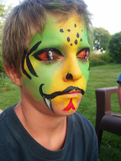
This summer I have picked up face painting which is a lot of fun. My painting skills have definitely improved because of this. Th...